
 Web & Software Development
 How Celion Builds a Website: From First Message to Launch
Celion builds websites not as decoration, but for a business purpose: we map the customer journey, add security from the...
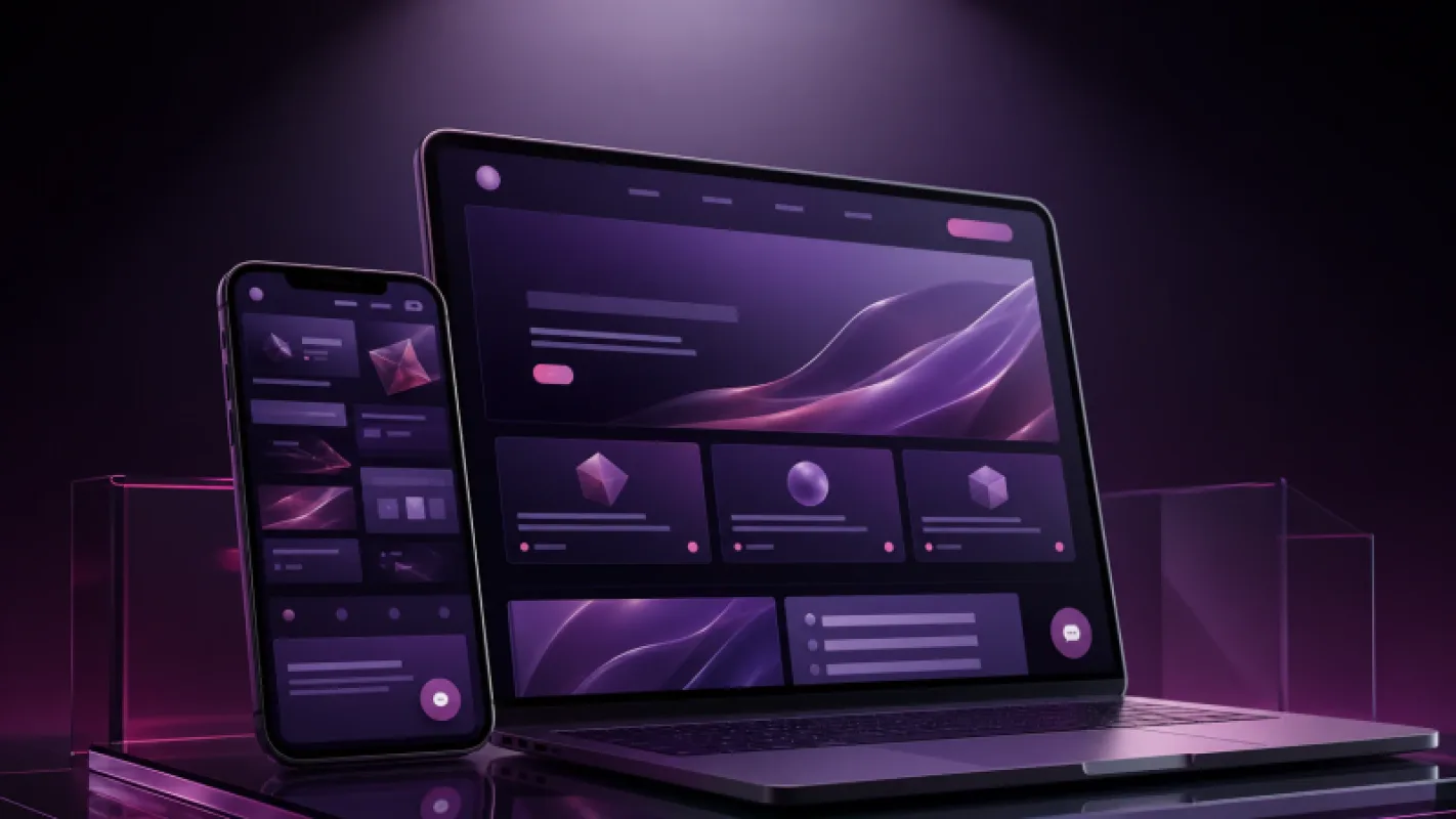
Monday, 9:20 a.m. The head of sales opens the meeting with a single sentence: "The advertising budget is the same, but inquiries from the website have dropped." Someone suggests changing the banner color. I start by opening the website on a phone. The page takes eight seconds to load, the menu is impossible to tap with a finger, and the Telegram button has disappeared below the bottom of the screen.
There are five signs that point to the need for a redesign:
You can fix one isolated problem. But when three appear at once, changing colors only wastes time. Cosmetic changes are not enough. The user journey and the website’s technical foundation need to be rebuilt, and the content must be rewritten to support them.
Users do not visit your website over fast office Wi-Fi. They open it in Telegram’s built-in browser, while traveling, or somewhere with a weak mobile connection. If text spills off the screen, buttons overlap, or an image takes too long to load, they will not stop to report the problem. They will go back.
According to DataReportal, Uzbekistan had 29.52 million internet users at the beginning of 2024. With an audience that large, treating the mobile version as an afterthought is expensive. Test your website on an average Android phone, using mobile data and the Telegram browser. Opening correctly on the director’s new iPhone is not a sufficient test.
3 seconds+Loading-time risk threshold
2 clicksTarget path to an inquiry
1 screenSpace in which the offer should be clear
If your homepage has seven services, three promotions, and five identical buttons, you are not giving users a choice. You are giving them work. The NN/g guideline is simple: people should understand what an element does before they click it.
Bring the two most profitable paths to the front. On a clinic website, for example, they might be "Book an Appointment" and "View Prices." Do not let the remaining sections bury those two actions.

When a website is difficult to use on mobile, customers may leave before inquiring.
The following signs show that your navigation has become unmanageable.
01
Pages with the same purpose are hidden behind different names.
02
Every block sends the user in a different direction.
03
Prices, addresses, or delivery terms are difficult to find.
04
Prices or terms differ across the Uzbek, Russian, and English pages.
An outdated look is not just a matter of taste. It gives customers an outdated impression of your company. A private clinic in Samarkand may have installed new equipment and expanded its team of doctors. Yet its website still shows a photo of the interior from 2018, old prices, and blurry pictures taken on a phone.
Customers form an opinion from that page before they ever visit the office. When the actual quality of the service does not match the impression created by the website, a redesign is not about making the brand "prettier." It is about presenting the business as it really is today.
A furniture retailer in Tashkent was spending 12 million soums a month on advertising. There were plenty of clicks. But the website did not show product dimensions, delivery times, or installment terms. The button for asking a question through Telegram was also buried at the very bottom of the page. Advertising was not the problem.
In this situation, we measure the journey from visit to inquiry: which page people left, which button they did not click, and which form field made them stop. A redesign that begins without analysis merely repeats the same old assumptions in a different color.
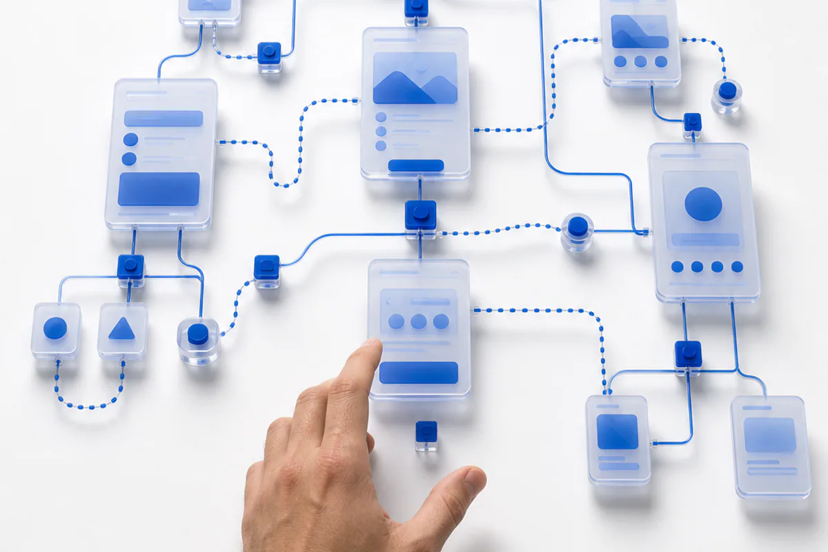
Clear navigation quickly guides each visitor toward the right action.
If you need to message a developer to update contact details, the menu breaks whenever a new service page is added, or every promotion requires custom code, the website cannot keep up with the pace of the business. This is not a design problem. It is technical debt.
Updating the appearance only hides that debt. A proper redesign organizes the CMS, allows reusable components to be managed from one place, and enables the team to update everyday content on its own. Complex integrations are separated through clear APIs.
The work begins with the problem and the metrics, not with a mockup.

A redesign should convert existing website traffic into more customer inquiries.
Base the decision to redesign on these criteria, not on personal taste.
How much does a website redesign cost in Uzbekistan?
A complete redesign of a standard corporate website often costs between 20 million soums and 60 million soums. A large catalog, user accounts, CRM integration, or custom calculations will increase the price. Check that the estimate includes research, mobile layouts, development, content migration, and testing.
How long does a redesign take?
For an average corporate website, 6 to 10 weeks is a realistic timeframe. User journeys and content are defined first, followed by design and development. If there are many integrations, the project may take 3 to 4 months. A one-week promise usually means adapting a ready-made template.
Is it enough to fix the website, or does it need to be rebuilt completely?
If there is only one problem—for example, the images are too large or a single form does not work—a targeted fix is enough. If mobile performance, navigation, and the CMS are all causing problems at the same time, repairing them piece by piece becomes expensive. When three or more signs appear together, a full audit and redesign is the sensible approach.
Will a redesign hurt our SEO results?
It can if the migration is handled incorrectly. The risk drops sharply when old URLs are mapped, permanent redirects are set up, and page titles are preserved. Indexing and internal links should be checked before launch. The design team should not leave this responsibility entirely to an SEO specialist.
If your website is losing inquiries instead of supporting sales, the Celion team can audit its user journey and technical condition. The audit will clearly show whether targeted fixes are enough or a redesign is needed. If necessary, we can also build the new website with CRM integration, a Telegram bot, or an AI assistant.
Callback
Leave your details and we will contact you shortly.
Become a Partner
Leave your contact details and we will get back to you shortly.
Order Service
Leave your phone number and we will contact you shortly.